
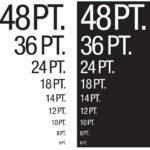
To ensure readability, if you use knockout type, or reverse type, it should be larger than 5 pt. size and should only knockout one or two colors. If you are knocking out type on a 4-color image, use a minimum of 8 pt. type.
If you use a serif font (with details on the ends of some of the strokes that make up letters and symbols) use a minimum of 5 pt. type, and only print the type in one color. If you choose, add drop shadows to your fonts before submitting for print.