
Let us try to understand the proper usage of tints and opacities.
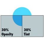
On a white background, a 30% black tint and a 30% opacity black will look similar (with the opacity slightly darker), but don’t be fooled – they are very different.
An opacity allows the designer to adjust the level of transparency that an object has. This means that all other objects below it can be seen through it, where as a tint will essentially adds white to a pure hue, lightening it, but allowing it to remain opaque.