
There are two things to be aware of when working with colored text: Due to their physical limitations, all printing presses may experience slight variations in the positioning of the cyan, magenta, yellow and black plates. Any deviance among the four plates is called misregisration. The printed result of misregistration is colored “halos” around your smaller, finer elements such as text or thin lines. We recommend that colored text is used only at sizes larger than 12 point. This also...
read more
No comments Blog
Outlined Fonts
Before you submit artwork for print, know that you must supply all your fonts with your native file. Another option for your fonts is to outline them. Outlining you fonts ensure your message is crisp and readable; avoiding fuzzy edges. Also never use the stylization palette to bold, italicize, add drop shadow or put outline on your fonts....
read more
No comments Font Size, Type and Color
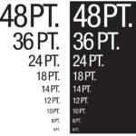
To ensure readability, if you use knockout type, or reverse type, it should be larger than 5 pt. size and should only knockout one or two colors. If you are knocking out type on a 4-color image, use a minimum of 8 pt. type. If you use a serif font (with details on the ends of some of the strokes that make up letters and symbols) use a minimum of 5 pt. type, and only print the type in one...
read more
No comments